
NBC, National Broadcasting Company
1979
Time Warner and Time Warner Cable
2011

Radio Free Europe/Radio Liberty
2011

EPA Identity and Graphic Standards Guidelines
2017

Telemundo Television
2011
Univision Graphics and branding Program
2011
Kaplan Thaler Group
2011
Merck Brand Identity System
2011
Young Artist Performances
2018

Alhurra TV Network
2011
Voice of America
2011
National Parks of New York Harbor
2011
Active Aging brand identity
2011
Charles Square and Charles Square Hotel, Cambridge, MA
2011
Greenwing Motorcycles, Thailand
2011
Hypertherm
2012
Alvin Ailey Dance Theater
2011
Barneys New York
2011
The Bond Market Association
2011

Canal 13, Buenos Aires, Argentina
2011
Calamos Asset Management
2011

Hotel Mia and Top of the Port Restaurant
2011

MercyCorps
2011
MercyFirst
2011
mPress Graphics
2011

NFF Nonprofit Finance Fund
2011
Hillier Architects
2011
Crane Business Papers
2011
Centro de Convenciones de Cartagena
2011
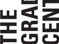
CUNY Graduate Center Brand Identity System
2011
Birmingham Museum of Art
2011
New York Public Library 100th Anniversary
2016
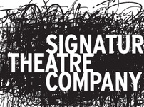
Signature Theater Company
2011
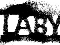
Labyrinth Theater Company
2011
Hear US campaign
2011
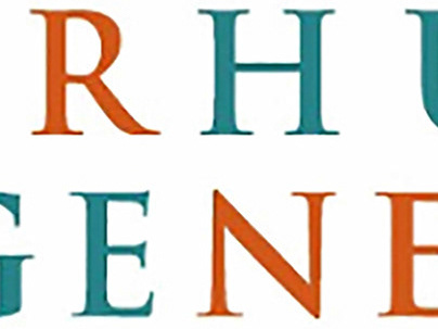
Greater Hudson Heritage Network
2014

New 42nd Street
2011
Multicanal, Artear, Argentina
2011

Maple Grove Community Center and Cemetery
2011

Hypertherm
2012
HealthQuest logo
2012
LIIF, Low Income Investment Fund
2011
LOGO Brands
2017
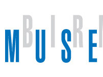
Toledo Museum of Art
2011
Andrews Mc Meel Universal
2011

ACE American Cinema Editors
2011
New Victory Theater
2011
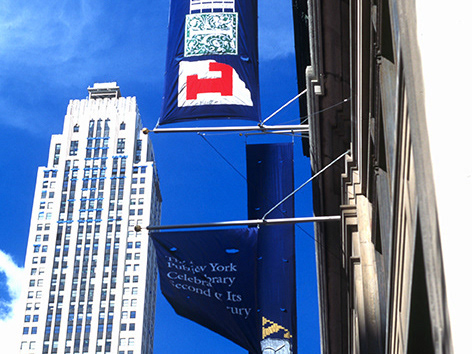
New York Public Library
2011

Darien Library
2011
Conrad Hotels
2011
Anti-Defamation League Brand Identity
2012

Social Media Victims Law Center
2022