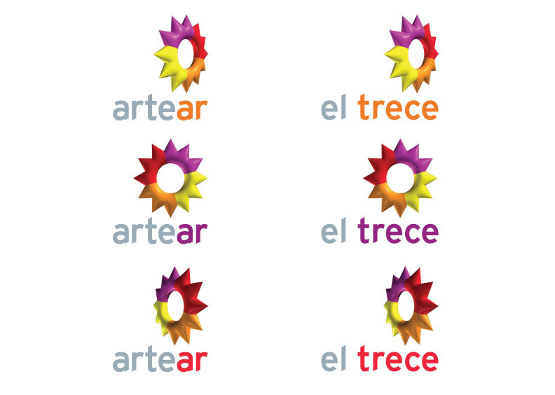

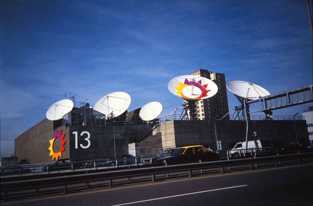
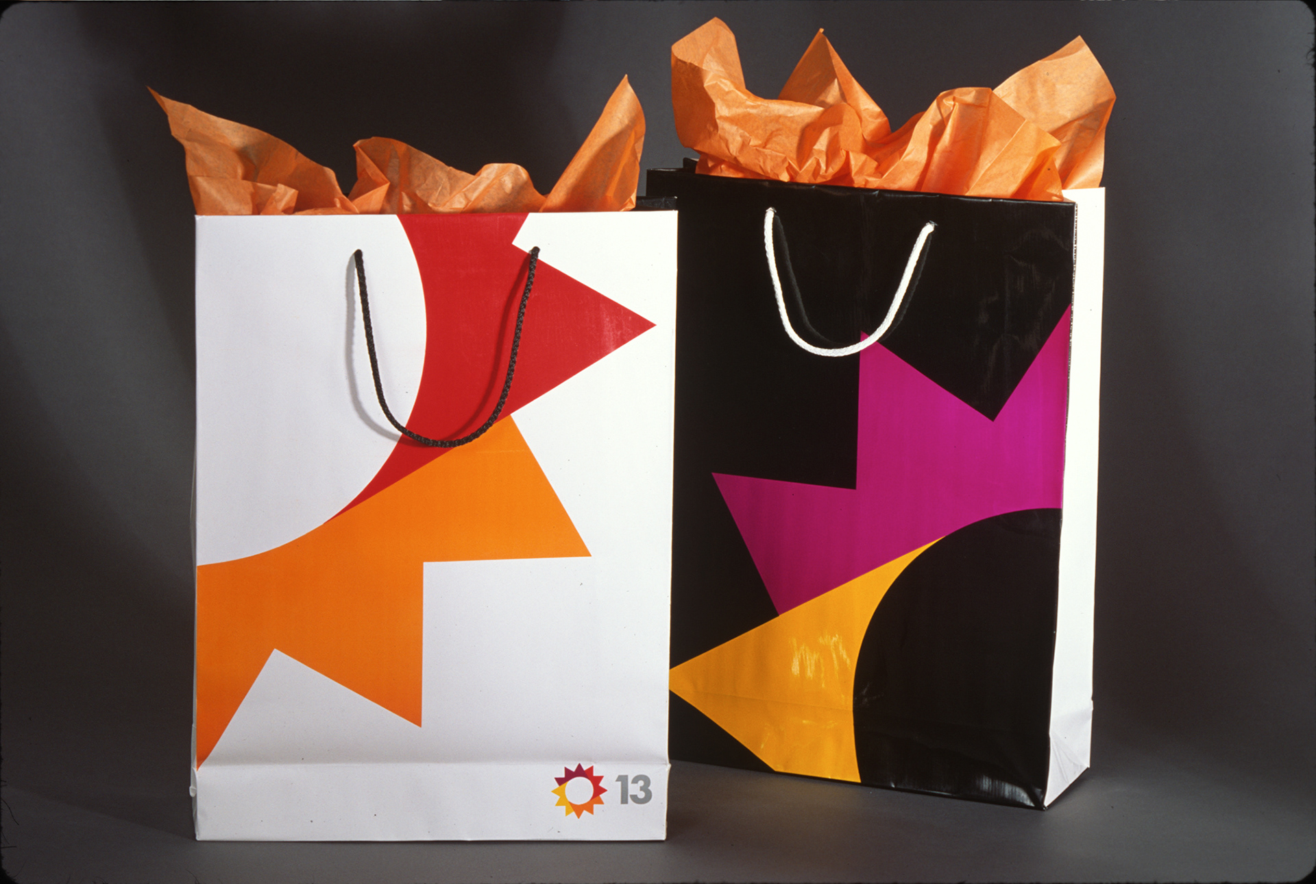

Artear / El Trece Television Channel, Buenos Aires, Argentina Brand Update Artear returned to us in 2008 for some new thinking, a refresh of the brand identity and a new brand architecture for their many subsidiaries. Because most people experience the identity during a broadcast, not in static form, the reinvented mark was built to be in continuous, elegant motion. For any necessary static applications, the symbol is shown frozen in mid-turn, literally a still from the animated version. Graphic guidelines in Castillian Spanish were also created to help Artear manage its complex brand across all its new properties.